Layout
Your project is divided into sections, which we refer to as "Spaces." Every space allows you to display or hide certain divs, widgets, or tools.
Depending on whether you used a template or not, we have preset these settings. However, you have full control over them and can modify them as you wish.
Header Space

This is the header of your project. It is best to display a notice project when you decide to have one on a complete page like this one.
However, if you integrate your project into a div in the centre of your page, for example, you'll prefer to hide it.
Project Title
The project title will be display like 'Notice Docs' that you can see the image above.
Project Logo
If it is already configured in the General Tab, you are ready to display it.
Top Space

You will be able to add multiple widgets and features in this area. Unlike the Header space, the Top space should be used in the majority of your projects; this is where you will find the page title, language selector, theme switcher, contact form, and so on.
By clicking here, you can see it in action in a live project.
Page Title
Display the page title for every pages in the project. (do not mix up project title and page title.)
Search
Enabling the search bar in your project settings will allow your entire project to be indexed, and a search icon will be added in the Top Space.
This will allow visitors to easily search for any content within your project and be redirected to the relevant section upon clicking the search results.
Contact Form
Enable visitors to write an email to you, simply set up a valid email address and activate it. Once activated, an icon will be displayed in your Top Space allowing visitors to easily send you an email.
Theme Switch
Allow visitors to switch between light and dark modes. In the Styling tab you can customise colors for both modes to suit your preferences.
Language Selector
Enabling this option will add a language selector with all of your available translations. Visitors will be able to select the language they prefer.
- Please note that if your project is not fully translated, any untranslated blocks will fall back to the default language.
- If you want to force a specific language to be selected, you can use query parameters in your project URL.
Breadcrumb Navigtion
Allow users to navigate from a current to a parent page :

Time to read
Show users how long will it take to read the current page.
It is calculated automatically when you publish your project.
Social Share
It allows users to share your page various social media platforms.
For now we have 3 options:
- X (Twitter)
Here is an exemple for facebook : (this is a screenshot)

Left Space
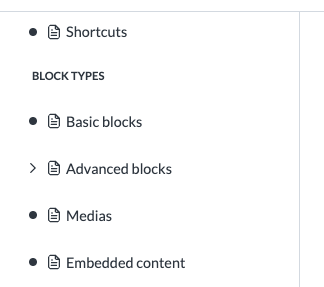
This space contains only one component, but it is really important when creating a well-organized project, such as documentation or a help center.
Navigation Menu
In this menu you have the whole page tree of your project. You'll be able to access any page of the project using this menu. It is extremely useful for avoiding getting lost in large amounts of documentation.
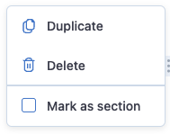
To organize the project navigation menu, you can set certain headings within your project as sections. This will allow the navigation menu to display a more structured and organised hierarchy of pages and sections.
Right Space
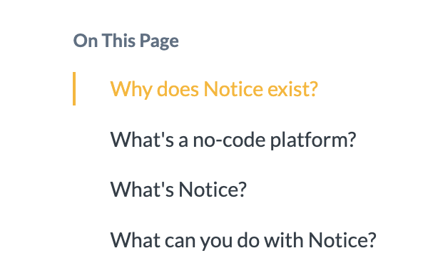
In the Right Space you'll find useful tools that are directly related to the current page.
Anchor Menu
Displays a list of all headings within the current page.
By clicking on a heading within the anchor menu, visitors will be redirected to the corresponding section in the page.
When you share a link to your project you can specify the anchor, on click it will scrolls to the good section.
example :
https://documentation.mynotice.io/?page=advanced-blocks-a57a#page-7cc6
Bottom Space

Bottom Navigation
Add Buttons that redirect to the previous and the next page of your project. (useful for documentation, help center, ...)
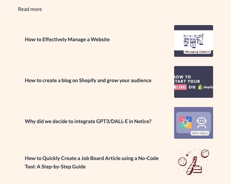
Read More Articles
By selecting this option, the visitor will see a list of other articles from the current that are not currently displayed on the current page. (Useful for blogs)
Scroll to top
Allow users to scroll to the top of the page when they reach the bottom by clicking the 'Go to top' button.
Social Share
(Identical to Top Space)